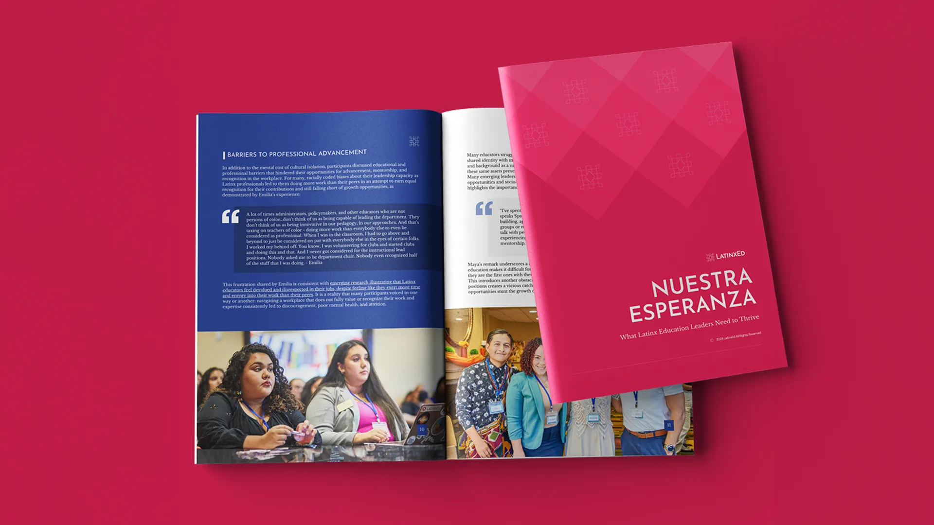
LatinxEd — Nuestra Esperanza
What Latinx Education Leaders Need to Thrive. Interview research carried at length, with participant quotes given room instead of trimmed to pull-quotes.
Read Nuestra EsperanzaFoundations and advocacy organizations publish research that has to be read by people who are under no obligation to read it. Report and publication design is the part that decides whether they do.
Almost nobody reads a report front to back. A program officer opens it looking for the finding. A journalist opens it looking for the number and where it came from. A board member opens it the night before the meeting. The design has to serve all three at once, and it has to do it without turning an argument into a brochure.
That is mostly a structural problem rather than a decorative one. It means a hierarchy that still works on page sixty, data visualisation built from the actual dataset rather than drawn to look impressive, and a cover that earns the click or the pick-up. Research that nobody opens has the same practical effect as research nobody funded.
Most of this work sits inside a longer relationship. These are the same organizations whose sites and brands Monarch builds, which is why the publications look like they came from the same place as everything else they put out — and why a finding can move from a report to a landing page to a policy one-pager without being redesigned three times.
What Latinx Education Leaders Need to Thrive. Interview research carried at length, with participant quotes given room instead of trimmed to pull-quotes.
Read Nuestra Esperanza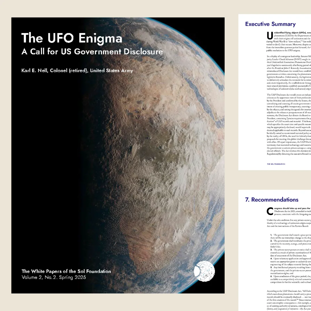
The UFO Enigma: A Call for US Government Disclosure. A white paper written for policymakers, composed so the argument survives a skim.
Read the white paper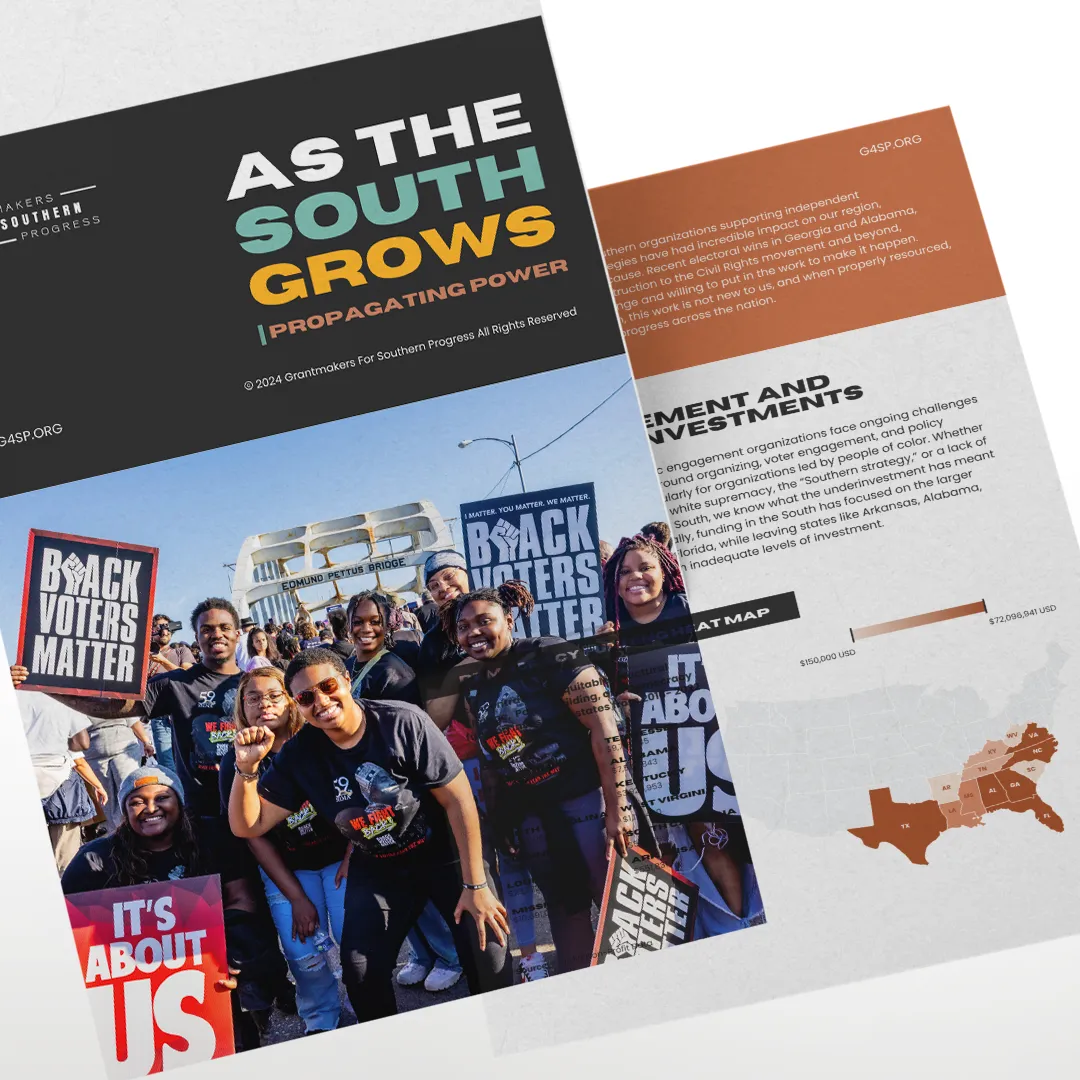
As the South Grows: Propagating Power. Funding research where the argument is the data, so the state-by-state heat map had to read at a glance and hold up under scrutiny.
Read As the South Grows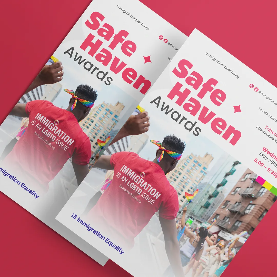
Safe Haven Awards. Print for an annual awards evening, built from the organization’s own campaign photography rather than stock.
See Immigration Equality’s reportsLong documents structured so the argument survives a skim — hierarchy, pacing, and a grid that still holds on page sixty.
Charts, maps and diagrams built from the real dataset, and legible at both print size and on a phone.
A single page that carries the finding on its own, because that is the page that gets screenshotted and shared.
Original artwork where stock photography would flatten the subject or misrepresent the people in it.
The cover decides whether it gets opened. Longer series often need their own mark that still belongs to the parent brand.
A web version that is a real page rather than a PDF in a viewer, so the research is findable, linkable and quotable.
Files prepared to the printer’s specification, with proofs checked before anything goes on press.
Both editions set in one system and laid out properly, not poured into a template built for only one of them.